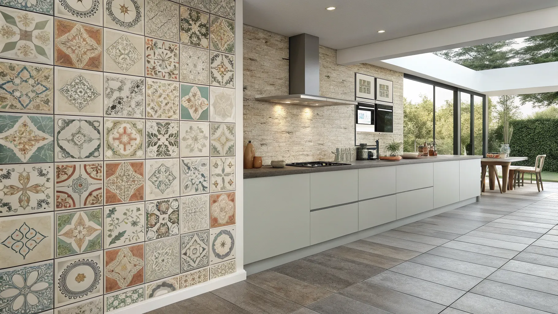
Wondering which kitchen wall tiles can make your space look better while still standing up to daily cooking, splashes, and cleanup?
This guide walks you through 25 kitchen wall tiles ideas, from timeless basics to bolder design choices, so you can compare styles, finishes, colors, and layouts with confidence.
Keep reading to find options that suit your kitchen’s size, light, cabinets, and everyday routine without sacrificing style for function.
1. Classic Subway Tiles for a Timeless Everyday Look
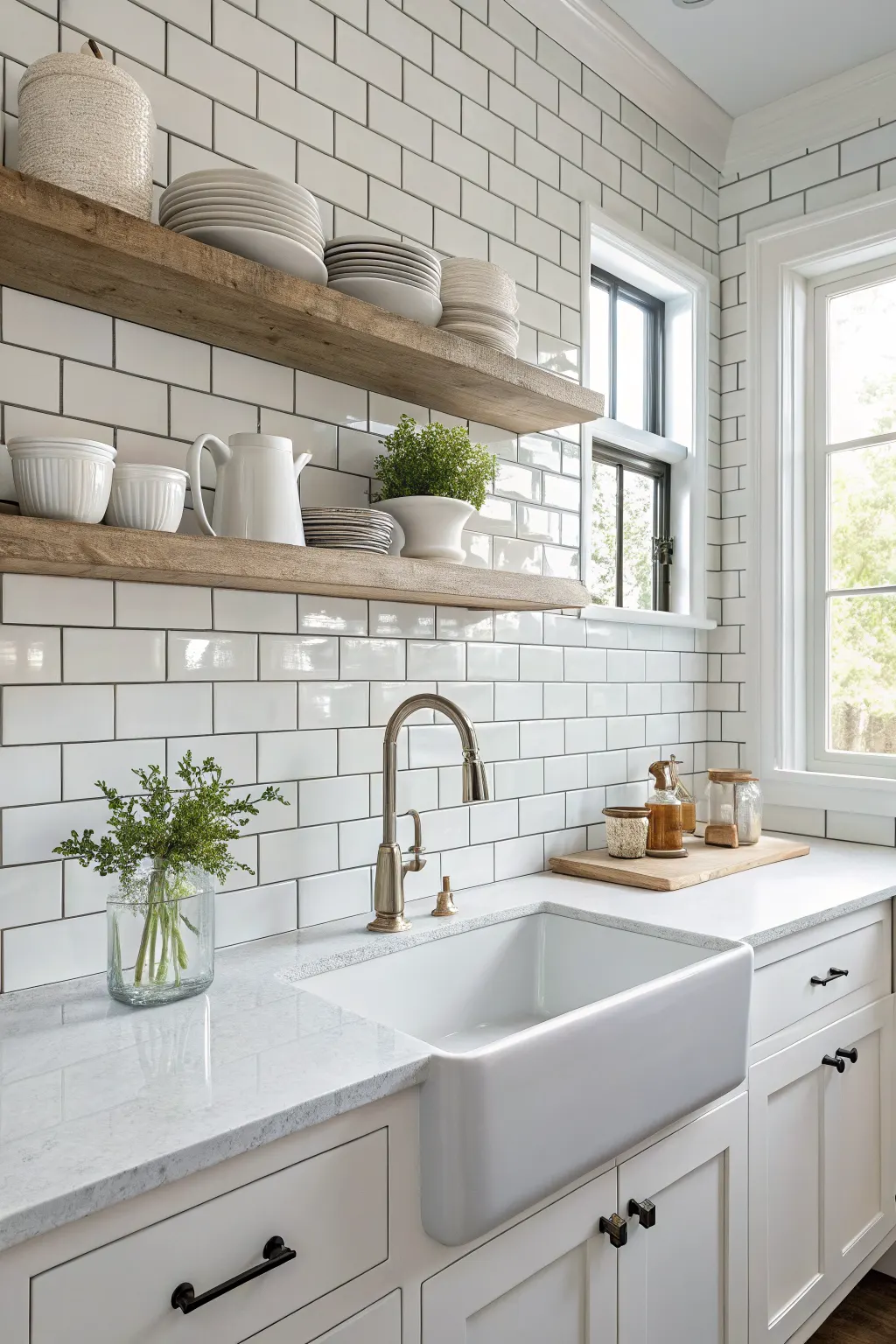
Subway tiles remain one of the most reliable choices for kitchen wall tiles because they work with almost any design style. They can look traditional, modern, farmhouse-inspired, or transitional depending on the finish, layout, and grout color you choose.
Part of their appeal is flexibility. A standard offset brick pattern feels familiar and classic, while a stacked layout looks cleaner and more current. Turn them vertically and the same tile suddenly feels more architectural.
Why they work so well
-
Easy to pair with many countertop materials
-
Simple to replace if one gets damaged
-
Smooth surfaces are usually easy to wipe down
-
Available in many sizes, finishes, and price points
Grout color matters here. White grout creates a crisp, seamless look, while gray or beige grout softens the contrast and can be more forgiving in busy kitchens. If you want a safe, lasting choice, subway tile is hard to rule out.
2. Zellige-Style Tiles for Soft Variation and Handmade Character
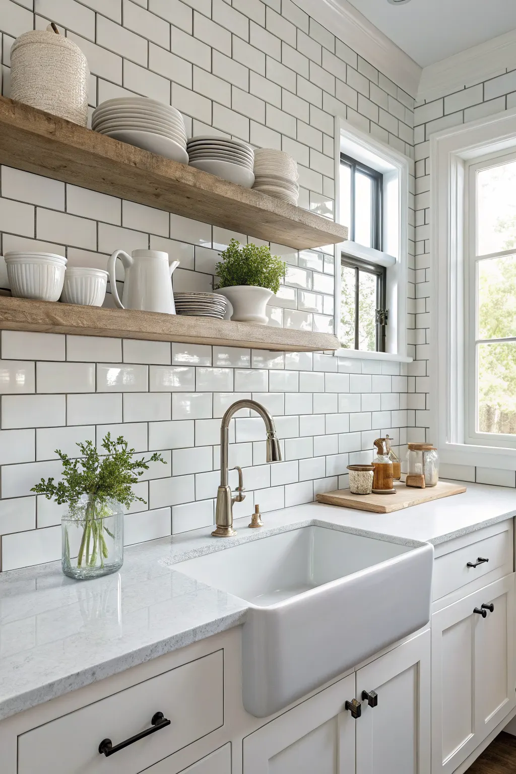
Zellige-style tiles bring subtle unevenness, tonal shifts, and glossy depth that machine-perfect tiles do not have. That variation gives kitchen walls warmth and movement without needing loud pattern or bold color.
They are especially attractive behind a range, around a window, or across a full backsplash where light can catch the slightly irregular glazed surface. In a neutral kitchen, they can be the feature even when the color is soft white, cream, blush, or muted green.
The key is to embrace inconsistency. If you want every tile to match exactly, this style may feel too organic. But if you like a relaxed, collected look, it can make the kitchen feel richer and less flat.
3. Marble-Look Wall Tiles for an Elegant High-End Feel
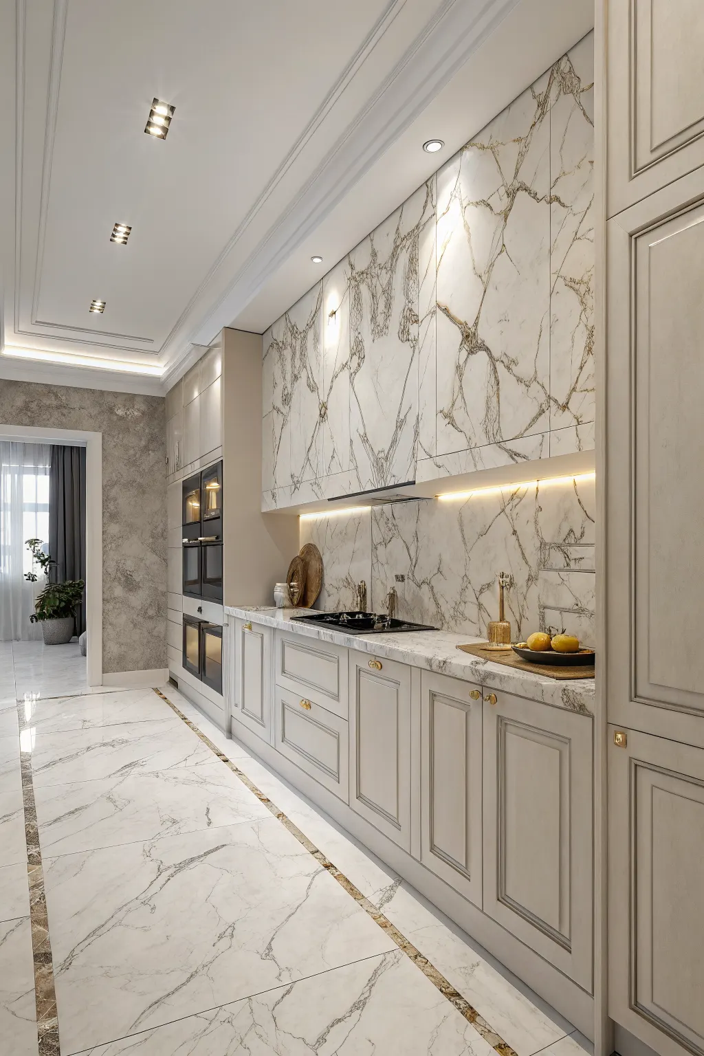
Marble-look tiles offer the refined appearance of veining and stone-inspired patterning without committing your kitchen walls to actual marble. They suit classic kitchens, modern spaces, and more luxurious designs depending on the scale of the pattern.
Large, dramatic veining creates more visual impact, while softer patterns feel calmer and easier to live with. In smaller kitchens, oversized veining can dominate the wall, so gentler versions often work better.
This look pairs nicely with brass hardware, matte black fixtures, or stainless accents. To keep the result polished, think about grout placement and tile size so the pattern feels intentional rather than chopped up.
4. Glossy White Tiles to Brighten a Smaller or Darker Kitchen
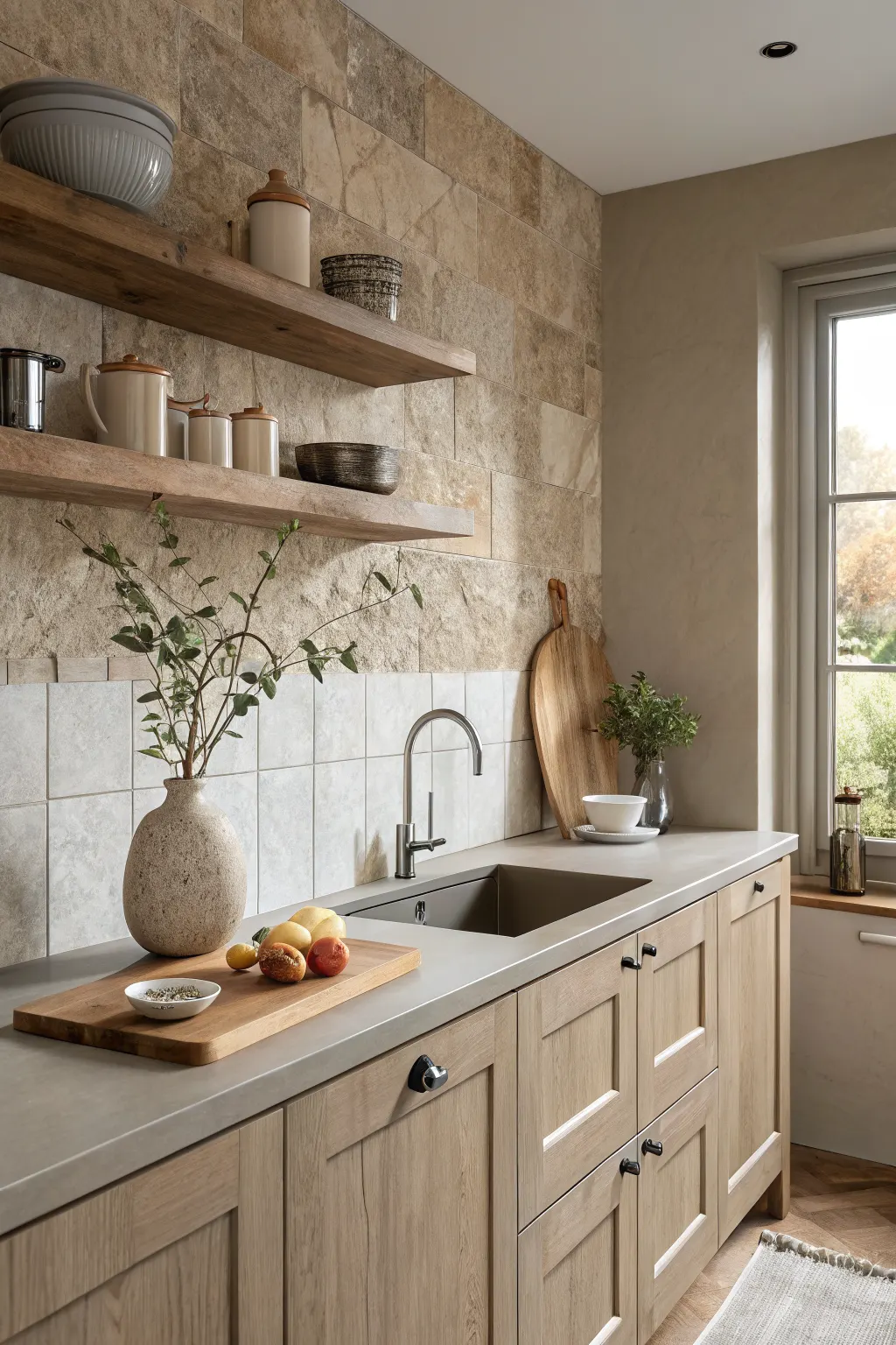
Glossy white kitchen wall tiles are a practical solution when a kitchen feels dim, compact, or closed in. Their reflective finish helps bounce both natural and artificial light around the room, making the space feel cleaner and more open.
Even a simple white tile can avoid looking plain if you add interest through shape, layout, or grout contrast. A glossy square tile, elongated rectangle, or narrow finger tile all create very different moods while keeping the same brightening effect.
Because white shows splashes and cooking residue more clearly, regular wiping helps maintain that crisp look. In return, you get a backsplash that feels fresh, versatile, and easy to coordinate with changing decor.
5. Matte Finish Tiles for a Calm, Understated Surface
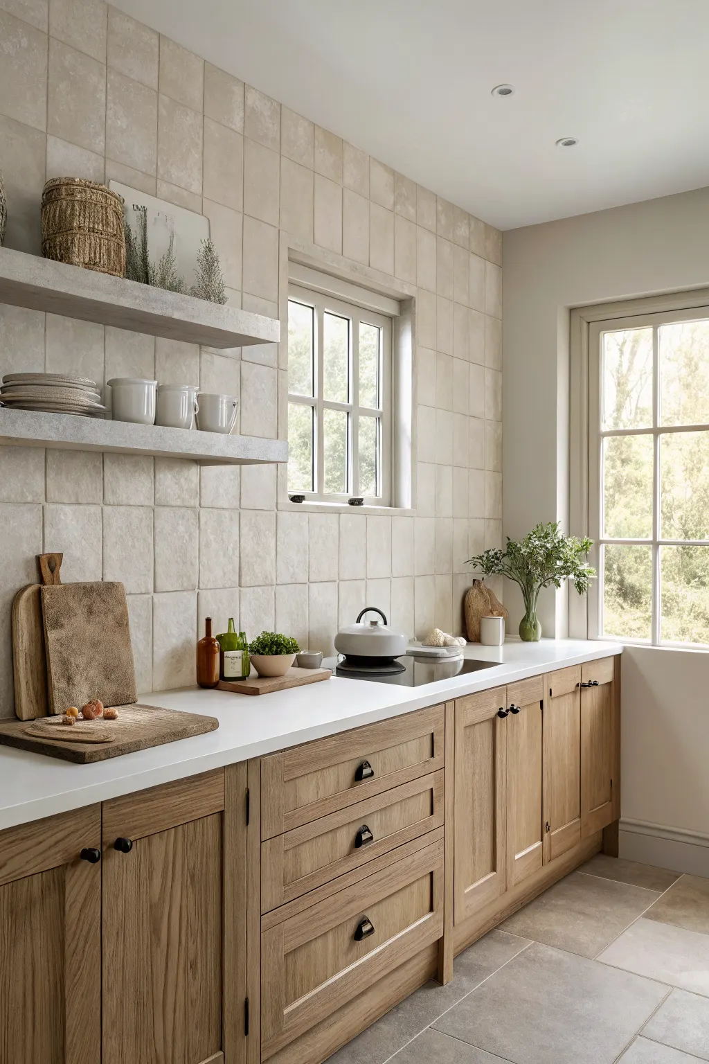
Matte tiles create a quieter visual effect than glossy ones. They absorb more light instead of reflecting it, which gives the wall a softer, more grounded appearance.
This makes them a strong choice for kitchens with natural wood cabinetry, stone-look counters, muted paint, or a warm minimalist style. If you want the backsplash to support the room instead of stealing attention, matte finishes are often the better fit.
It is worth bringing samples home before choosing a final color. Matte tiles can shift more noticeably under warm artificial light or limited daylight, and a shade that looks perfect in a showroom can read darker in your actual kitchen.
6. Large-Format Tiles for a Clean, Minimal Kitchen Wall
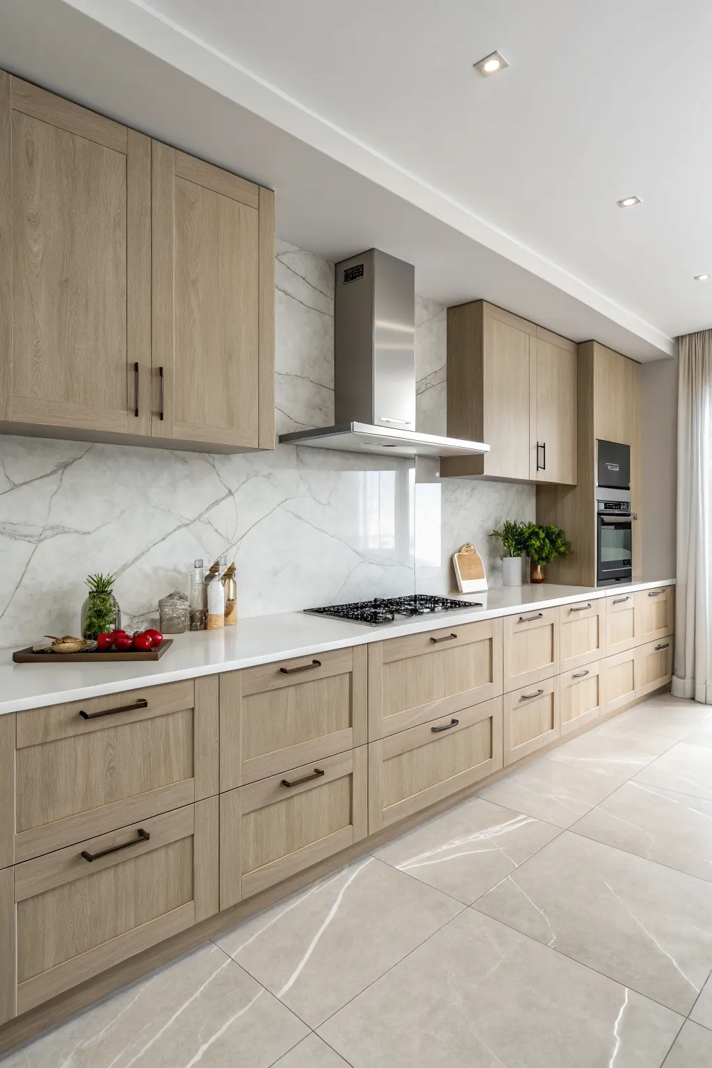
Large-format kitchen wall tiles create a sleek, uninterrupted surface with fewer grout lines. That can make the wall feel calmer and less visually busy, especially in kitchens that already have bold cabinet colors, pronounced countertop pattern, or open shelving.
They tend to suit contemporary and minimalist kitchens particularly well, but they can also work in transitional spaces where you want a simplified backdrop. Fewer grout joints can also mean easier routine wiping in splash-prone areas.
Planning matters more with larger tiles. Outlets, corners, and range hood edges need careful layout so the final installation does not feel awkward or overly cut up. When done well, large-format tile looks polished and intentional.
7. Mosaic Tiles for Detail, Texture, and Visual Interest
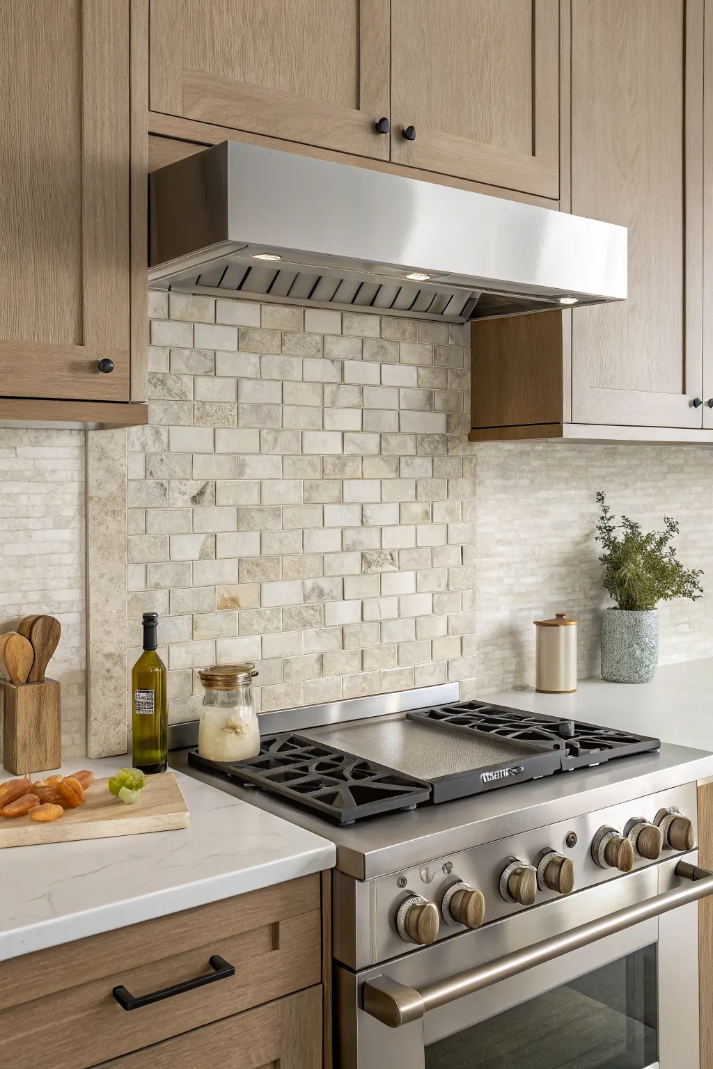
Mosaic tiles add fine-scale texture and pattern that larger tiles cannot. They are useful when a kitchen needs personality, but you do not want to commit to a huge bold motif or high-contrast color statement.
You can use mosaics across the full backsplash, but they are especially effective in smaller zones such as a niche, a panel behind the stove, or the wall above a coffee station. Material choice changes the feel dramatically. A neutral stone-look mosaic can be subtle, while metallic or glass mosaics read more decorative.
The tradeoff is grout. Smaller pieces mean more joints, so make sure you are comfortable with the extra visual texture and cleaning consideration before going all in.
8. Herringbone Tile Layout for Movement and Sophistication
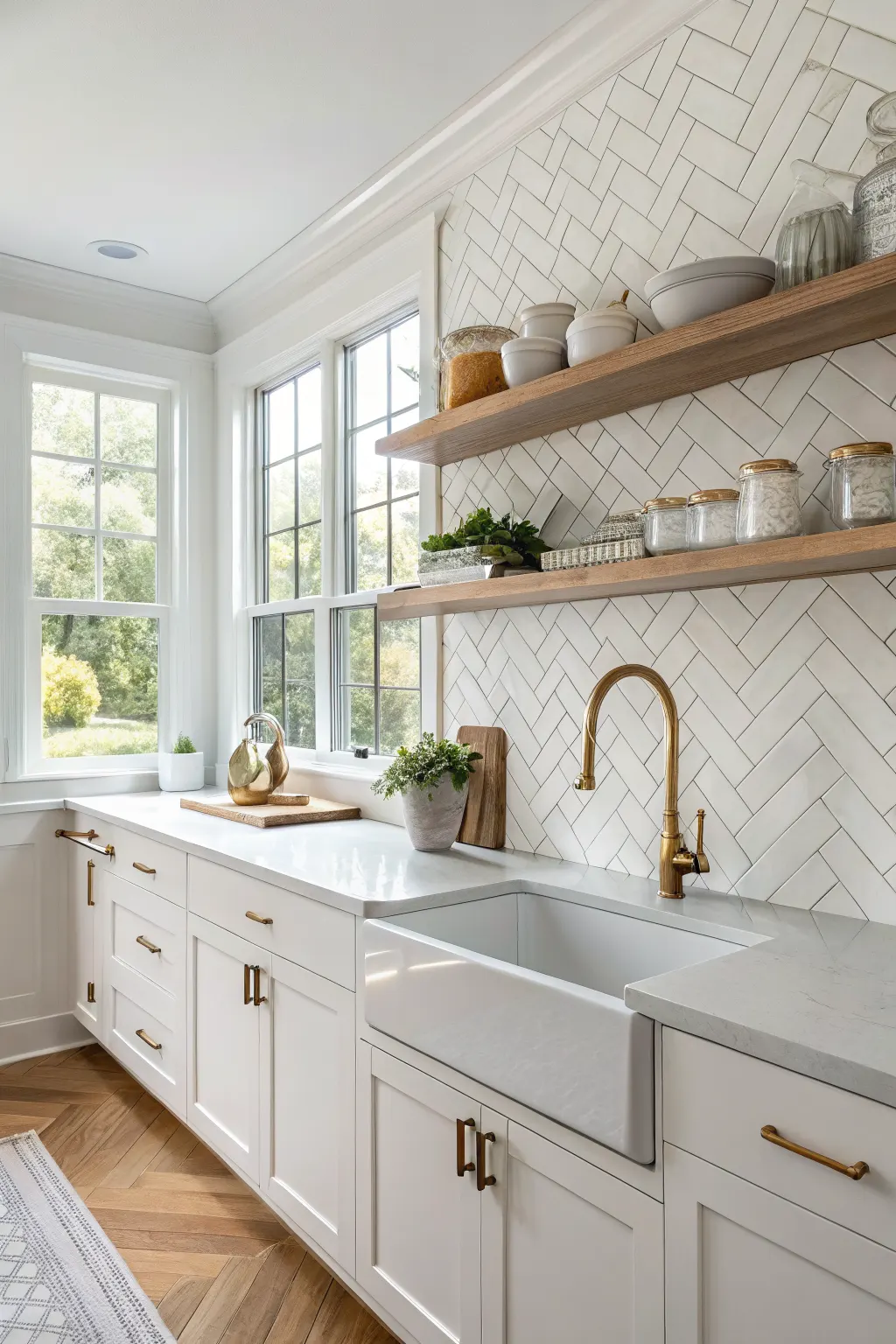
Herringbone adds motion and elegance to a kitchen wall without requiring an unusual tile shape. Even a basic rectangular tile looks more elevated when laid in this pattern.
This layout is especially helpful if you want your backsplash to feel custom but still timeless. It can bring energy to a simple color palette and prevent plain tiles from looking too basic.
Helpful placement ideas
-
Use it behind the range as a focal panel
-
Run it throughout the backsplash for a more tailored look
-
Angle the layout to suit narrow or wide wall sections
Because herringbone involves more cuts and alignment work, it benefits from careful installation. Precision matters, especially where the tile meets cabinets and counters.
9. Vertical Stacked Tiles for a Fresh Modern Update
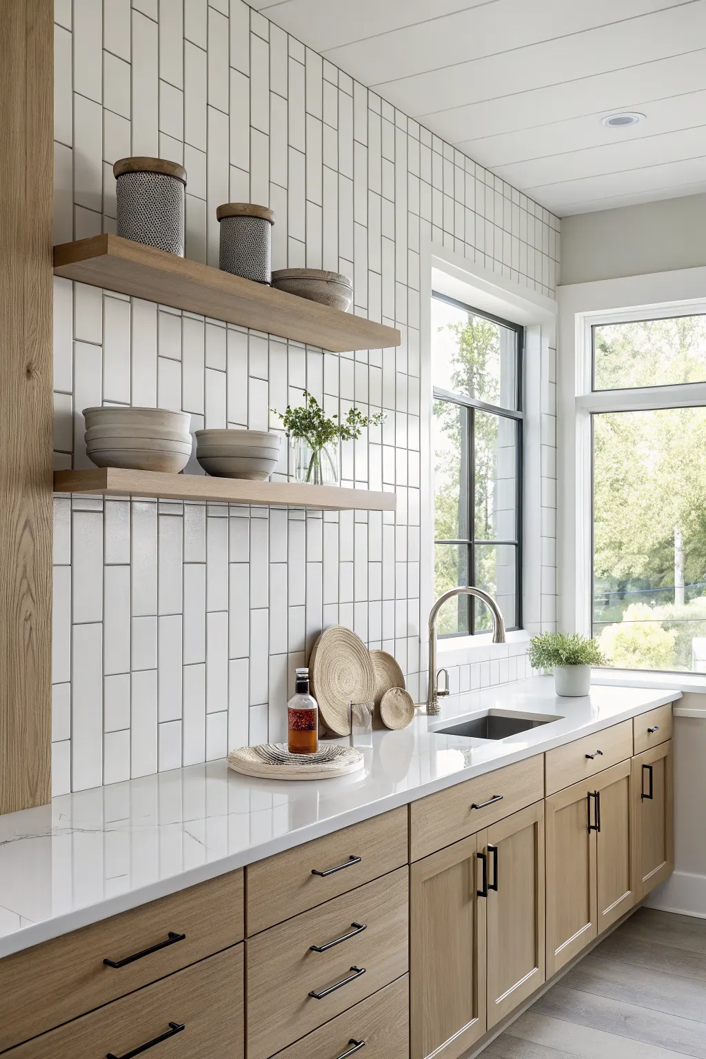
Vertical stacked tiles take familiar shapes and give them a more current feel. Instead of the traditional horizontal brick pattern, the tile stands upright in straight, clean columns.
This approach naturally draws the eye upward, which can help emphasize ceiling height in a smaller kitchen. It also works well with slab-front cabinets, open shelving, and streamlined hardware because the lines feel neat and intentional.
The look depends on consistency, so even spacing and tidy grout lines are important. If you love simple surfaces but want something less expected than standard subway tile, vertical stacking is an easy upgrade.
10. Hexagon Tiles for a Geometric, Contemporary Touch
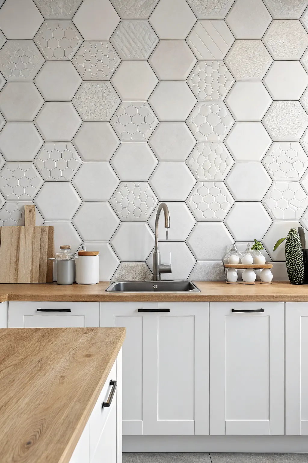
Hexagon tiles bring shape and geometry to the backsplash without looking overly busy. They are a good middle ground for homeowners who want more interest than rectangles or squares but do not want a full decorative pattern.
Small hex mosaics create texture and detail, while larger hex tiles feel more graphic and modern. Grout choice can either highlight the shape or let it blend more quietly into the wall.
Hex tiles can fit a wide range of kitchens. In white or soft neutral tones, they feel subtle and clean. In darker colors or mixed finishes, they become more of a design feature.
11. Patterned Tiles for a Bold Focal Point Behind the Stove
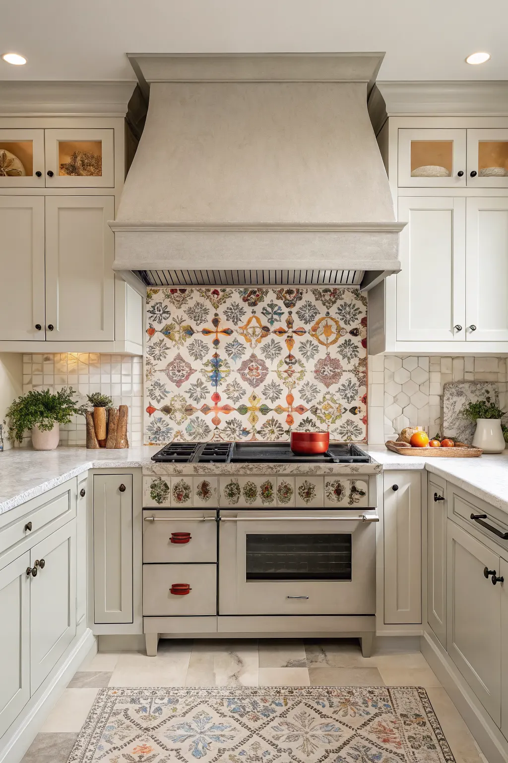
Patterned tiles are a strong way to define the cooking zone and give the kitchen a clear focal point. They work especially well behind the stove, where a contained area can support a more expressive design.
You can go in several directions here. Multicolor motifs feel lively and decorative, tonal patterns feel more restrained, and simple repeating prints can bridge the gap between classic and bold.
To keep the room balanced, pair a busy backsplash with simpler cabinets, counters, and open shelving. Also look at a large sample or mockup when possible. A pattern that looks charming on one tile can feel overwhelming when repeated across an entire wall.
12. Terracotta-Look Tiles for Warmth and Earthy Character
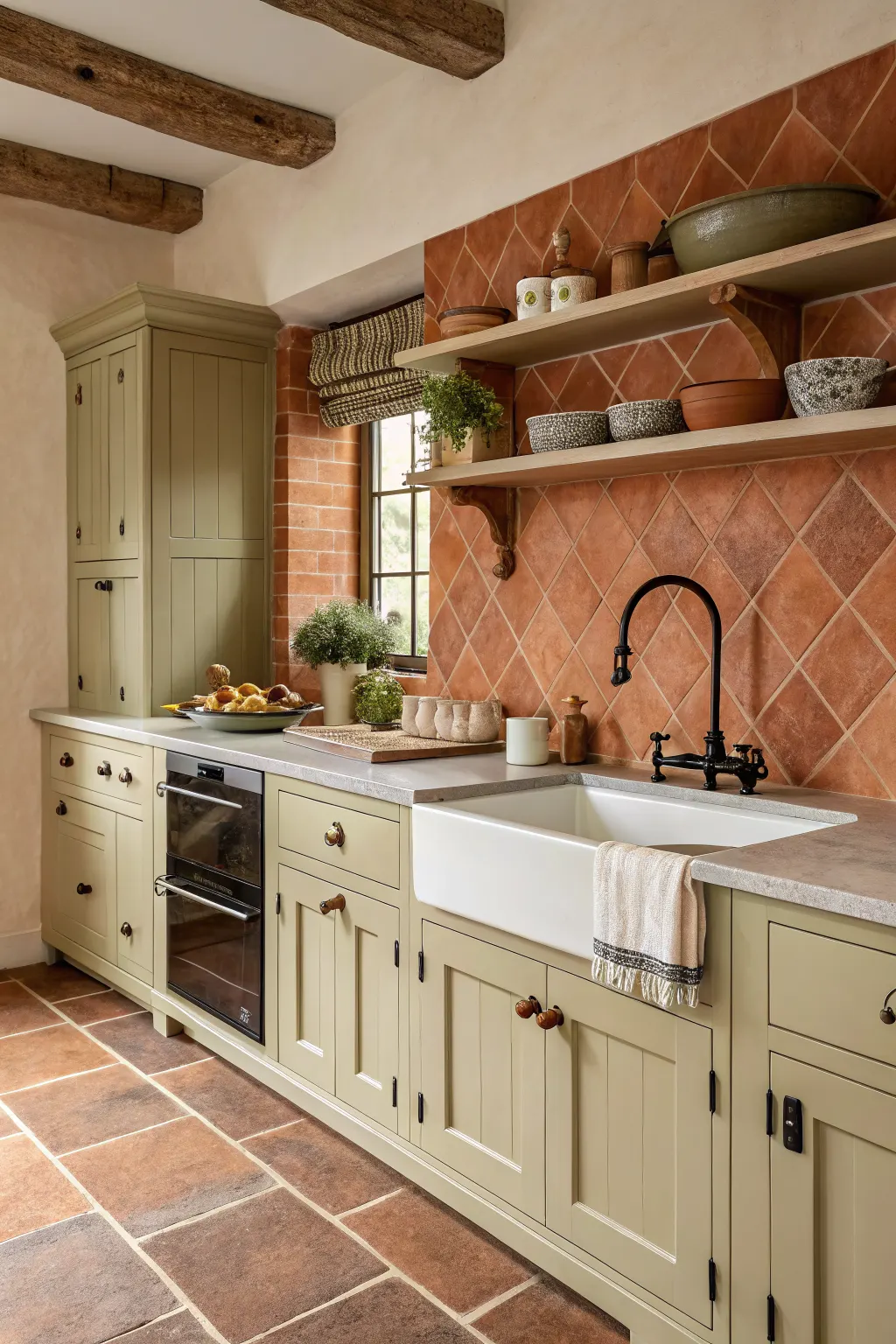
Terracotta-look kitchen wall tiles bring warmth that many cooler grays and bright whites do not. Their earthy tones can make a kitchen feel cozy, grounded, and welcoming.
They pair beautifully with cream cabinetry, olive accents, natural wood, black hardware, and aged brass details. In some kitchens, a full backsplash in terracotta tones feels rich and enveloping. In others, it works better as a smaller feature behind the cooktop or sink.
Because this palette is naturally warm, check how it interacts with your counters and floor. The goal is to create intentional warmth, not a clash of competing undertones.
13. Green Kitchen Wall Tiles for a Nature-Inspired Palette
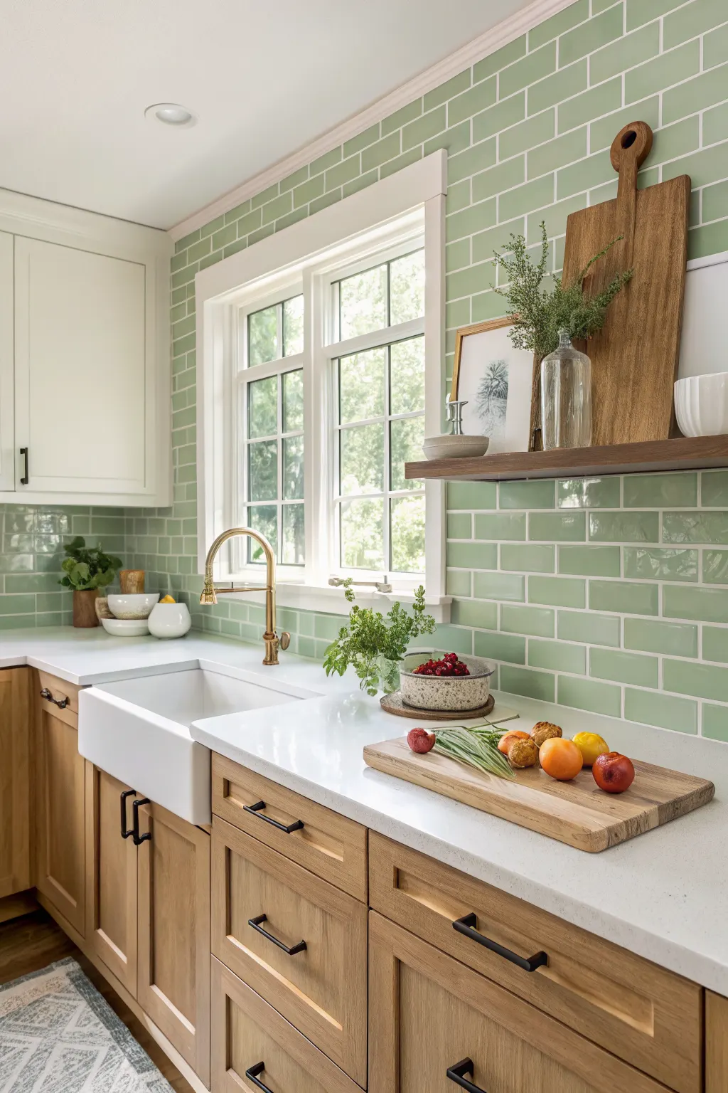
Green tiles can feel fresh, calming, classic, or dramatic depending on the shade. Soft sage creates a quiet and airy atmosphere, while deep forest or moss tones add richness and depth.
This is one of the most adaptable color families for kitchen wall tiles because it pairs well with so many materials. White counters keep it crisp, wood cabinetry warms it up, and brass hardware brings out the color’s depth.
As with any colored tile, testing samples matters. Green can lean gray, blue, or yellow depending on the light in your kitchen, so what looks balanced in one space can feel entirely different in another.
14. Blue Wall Tiles for a Crisp or Moody Design Statement
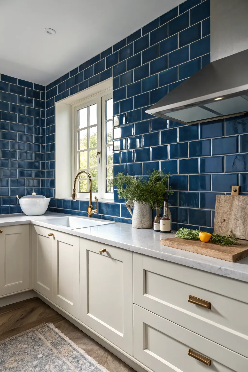
Blue kitchen wall tiles can shift the room in very different directions. Pale blue feels airy and clean, medium tones feel cheerful and classic, and navy or inky shades bring mood and contrast.
Blue works well in coastal-inspired kitchens, tailored traditional spaces, and sleek modern designs. The finish changes the effect too. A glossy glaze feels polished and bright, while a matte blue tile can feel quieter and more relaxed.
Be mindful of the relationship between the tile and cabinet color. Blue can be stunning, but if the surrounding finishes also compete for attention, the kitchen may start to feel visually crowded.
15. Black Tiles for Dramatic Contrast and Depth
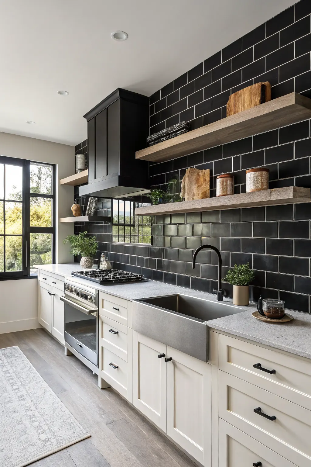
Black tiles make a kitchen feel bold, defined, and intentional. They can create striking contrast against white cabinets or blend into a darker palette for a more moody, cocooning look.
Finish matters a lot with black. Glossy black feels sharper and more glamorous, while matte or textured black softens the effect and can make the wall feel more architectural. Grout color also influences the mood, with matching grout feeling sleeker and lighter grout emphasizing each tile shape.
Before choosing black, think about the room’s lighting and your tolerance for visible marks. Splash spots and fingerprints may show more readily, especially near a cooktop or sink.
16. Beige and Greige Tiles for a Soft Neutral Foundation
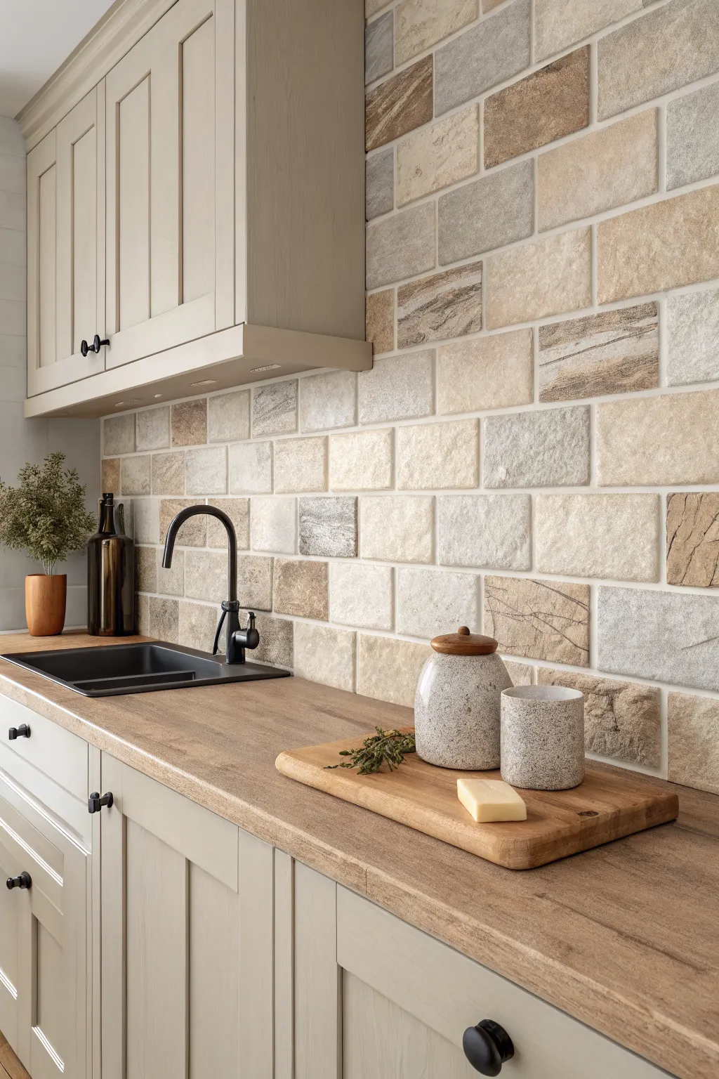
Beige and greige tiles are ideal when you want a backsplash that feels warm, flexible, and unlikely to date quickly. They can bridge modern and traditional features more easily than stark white or cooler gray.
These tones work well with wood accents, creamy paint colors, black fixtures, and many stone or quartz counters. They are especially useful in kitchens where you want the cabinetry or lighting to take the lead while the wall quietly supports the design.
Undertone matching is important. Some beige tiles lean pink, some yellow, and some gray, so compare them directly against cabinets, countertops, and wall paint before making a final decision.
17. Textured Tiles to Add Dimension Without Busy Pattern
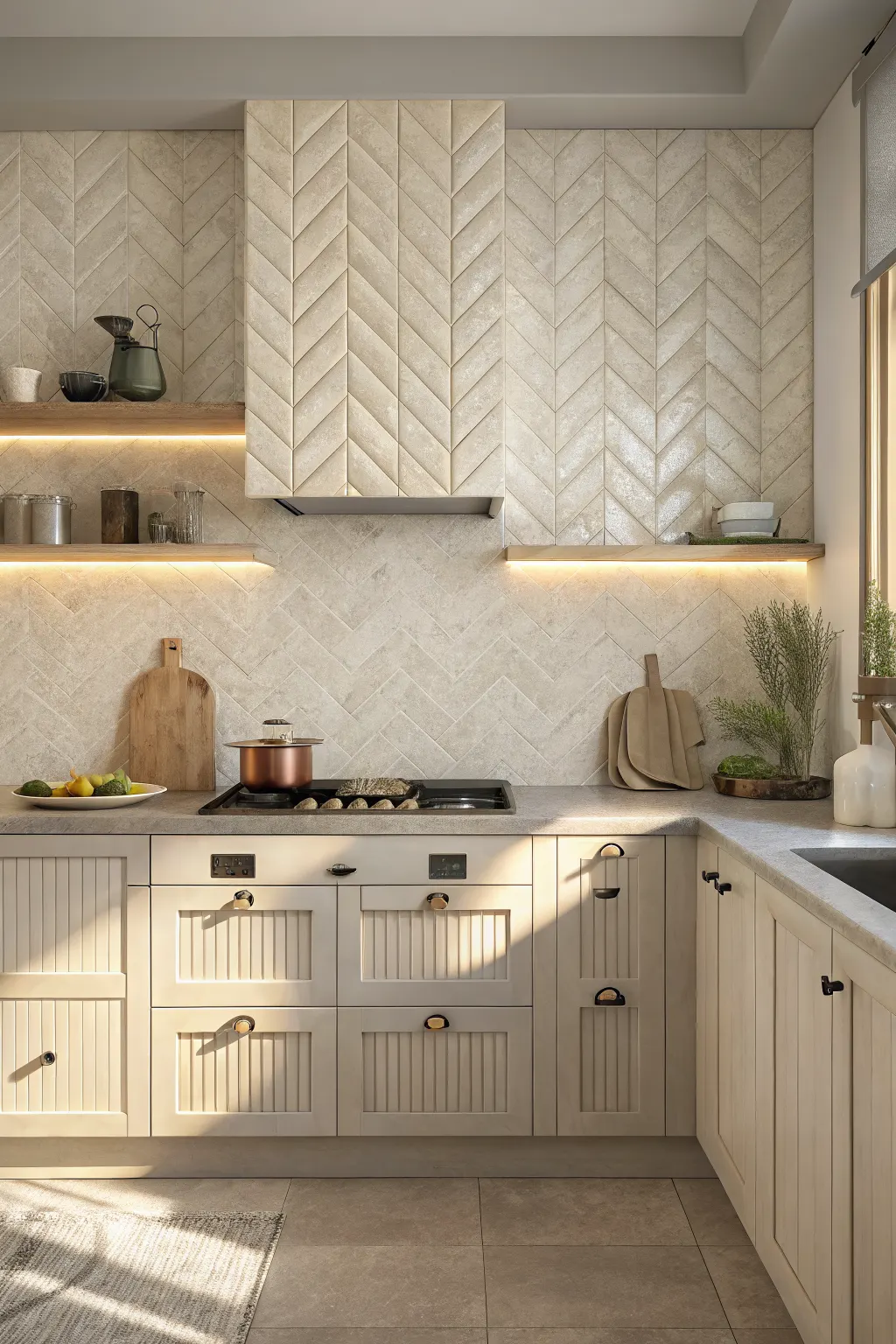
Textured kitchen wall tiles add interest through surface depth rather than strong print or bright color. Ribbed, fluted, handmade-look, and lightly sculpted tiles can make a simple backsplash feel much more layered.
These tiles are especially effective when side lighting or under-cabinet lighting can create soft shadow lines. That subtle play of light helps the wall feel more dynamic throughout the day.
Use textured tiles thoughtfully in heavy cooking areas. Deep grooves and strong relief can be harder to wipe clean around grease or splatter, so milder texture is often the more practical choice behind the range.
18. Glass Wall Tiles for Shine and Light Reflection
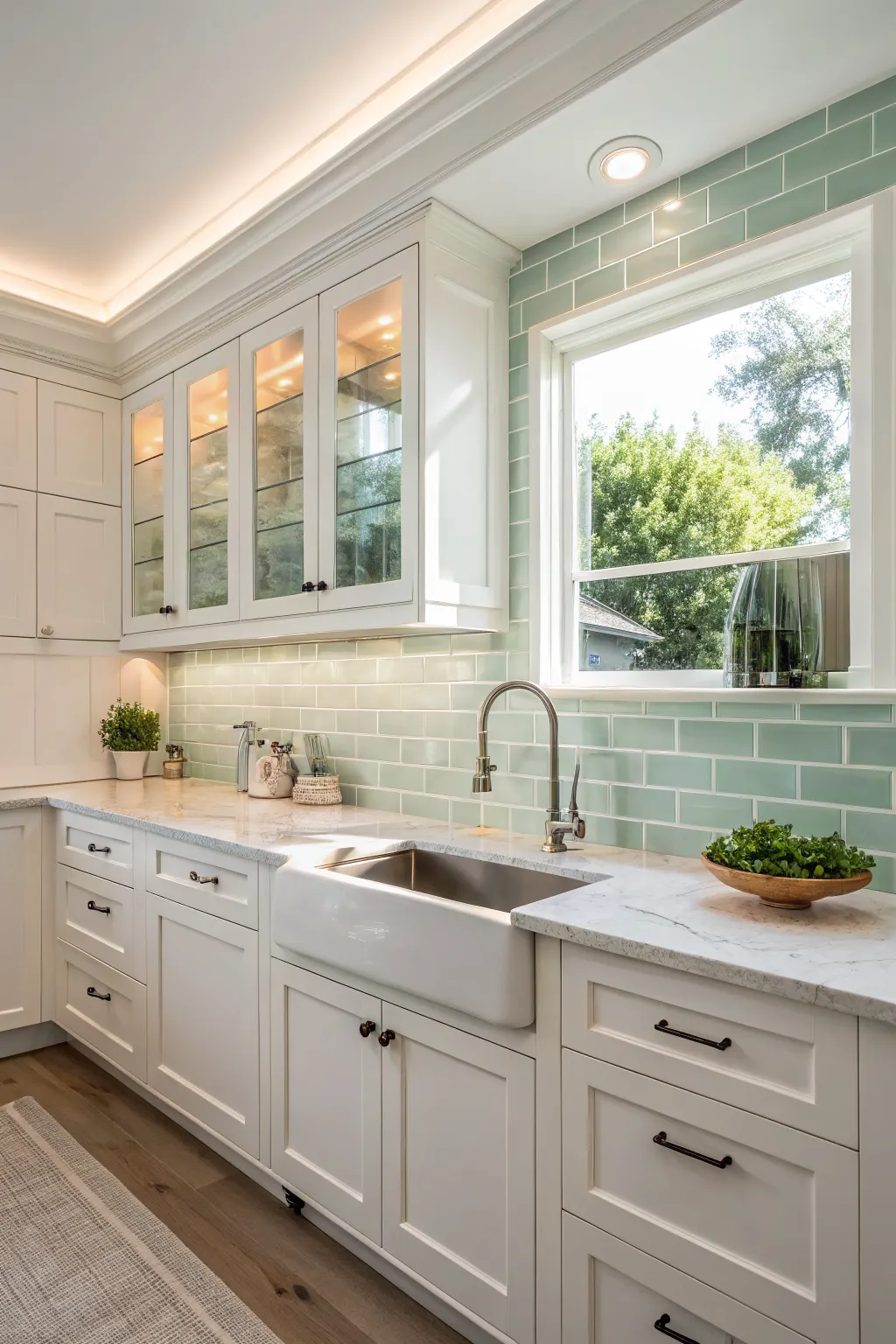
Glass tiles give kitchen walls a bright, polished finish that reflects light well. That makes them a smart option for compact kitchens, low-light spaces, or anyone who likes a cleaner, shinier aesthetic.
They come in many forms, including clear, frosted, colored, and mosaic styles. A pale glass tile can feel crisp and almost airy, while deeper colors read sleeker and more decorative.
Because glass is reflective, always consider what it will mirror back. Cabinet color, lighting warmth, and grout lines all affect the final look. In the right kitchen, glass can make the whole backsplash feel lighter and more luminous.
19. Stone-Look Tiles for Organic Texture and Natural Appeal
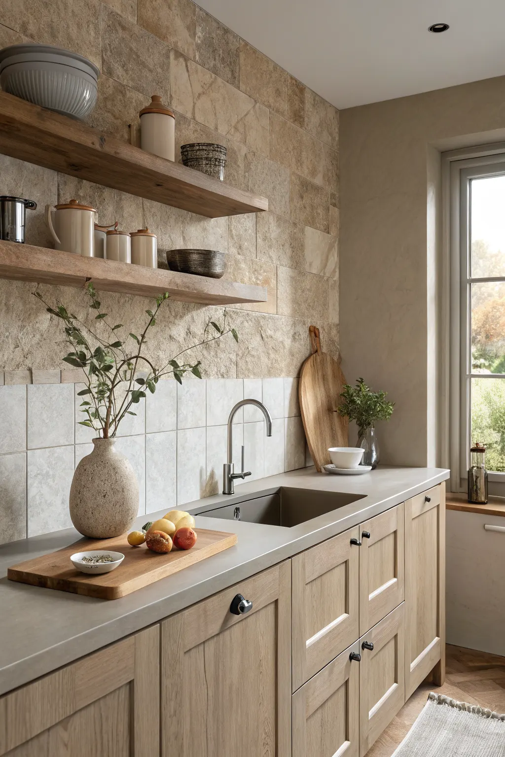
Stone-look tiles help create a kitchen that feels earthy, grounded, and layered. Depending on the exact style, they can lean rustic, Mediterranean, contemporary, or softly spa-like.
These tiles often pair best with natural wood, muted cabinetry, and restrained color palettes that let the texture speak. They are useful when you want the wall to feel less manufactured and more connected to natural materials.
Keep an eye on variation and surface depth. Some stone-look tiles are subtle and easy to live with, while others have enough texture and color shift to become the room’s main visual feature.
20. Metallic or Pearlescent Tiles for a Subtle Glam Accent
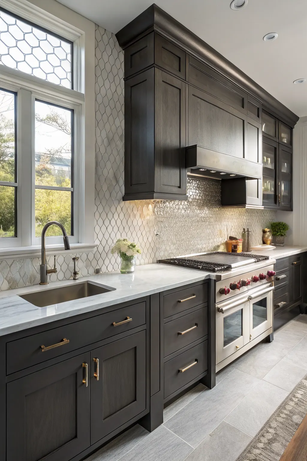
Metallic and pearlescent tiles catch light in a way that standard ceramic and porcelain tiles do not. They can add a refined shimmer that feels special without necessarily becoming flashy.
In most kitchens, these finishes work best as accents rather than across every wall. A small panel behind the range, a border detail, or a niche application is often enough to bring in that extra light-catching layer.
They pair especially well with darker cabinetry, luxe countertops, and streamlined fixtures. Always view them in changing light, since the finish can read warmer, cooler, bolder, or softer depending on the time of day.
21. Kit-Kat and Finger Tiles for Fine Linear Texture
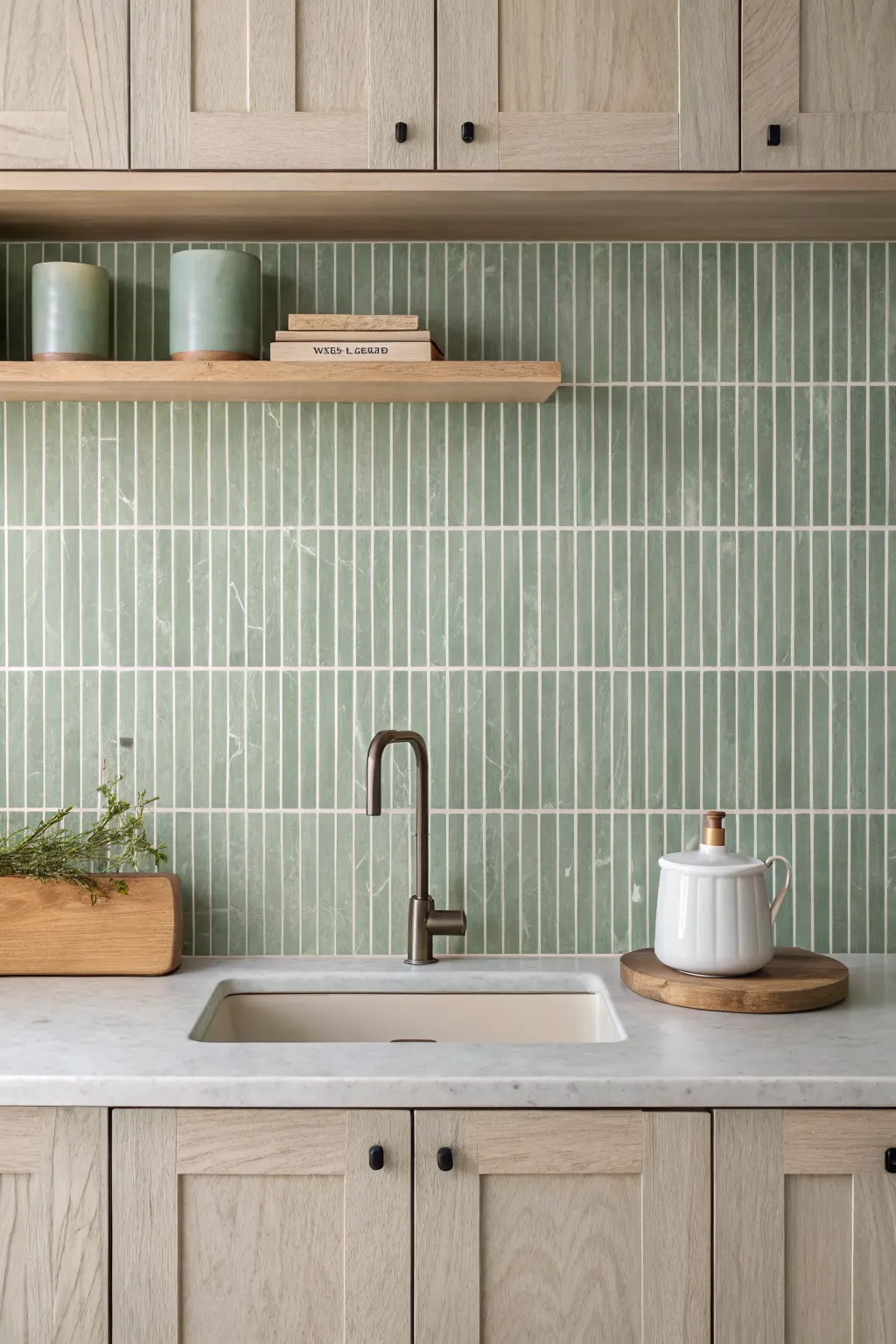
Kit-kat and finger tiles are long, narrow tiles that create a distinctive striped rhythm across the wall. Their slim profile makes even a simple color feel more tactile and designed.
Installed vertically, they can emphasize height and feel modern or spa-like. Installed horizontally, they stretch the eye across the room and can make a backsplash feel wider and calmer.
Because this format creates many grout lines, grout becomes part of the design. Matching grout keeps the look softer, while contrast grout makes the linear pattern stand out more clearly.
22. Checkerboard or Two-Tone Tile Designs for Graphic Contrast
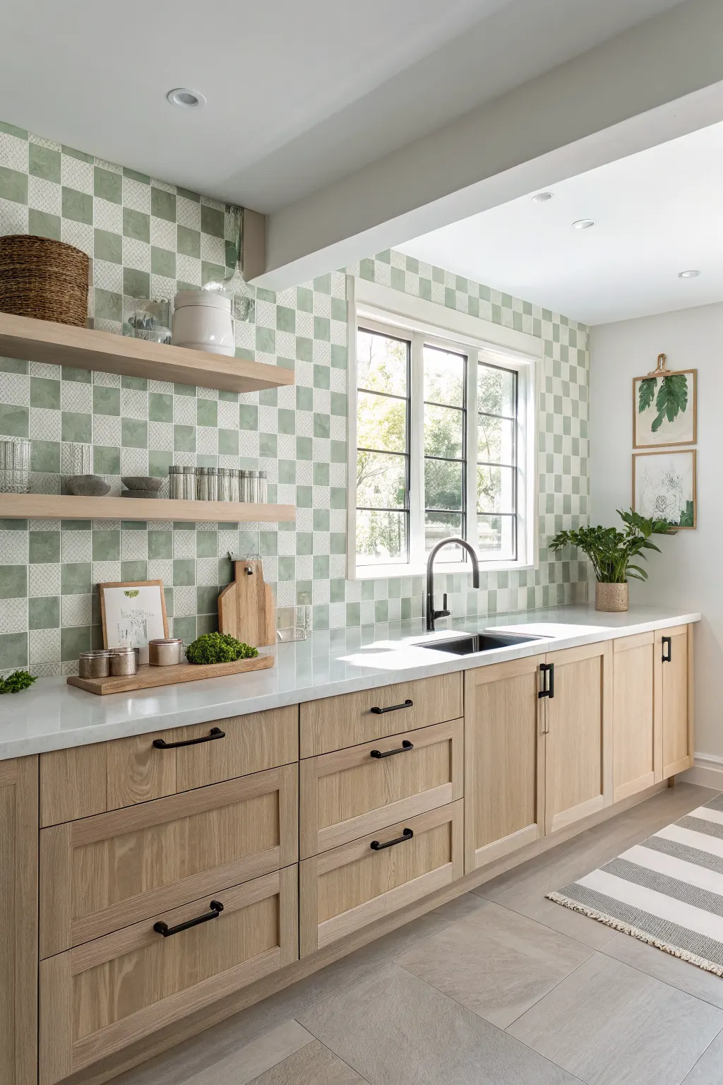
Two-tone tile designs bring personality through color contrast instead of complex pattern. A checkerboard layout feels graphic and playful, while other two-tone arrangements can feel retro, classic, or surprisingly modern.
The final effect depends heavily on the palette and tile shape. Black and white reads sharper and more dramatic, while cream and taupe feels softer and more traditional. Even muted green and white can give a backsplash a fresh custom look.
If you use this kind of visual contrast on the wall, it usually helps to keep nearby finishes calmer. Too many competing patterns can make the kitchen feel fragmented rather than stylish.
23. Full-Height Tiled Walls for a Seamless Statement
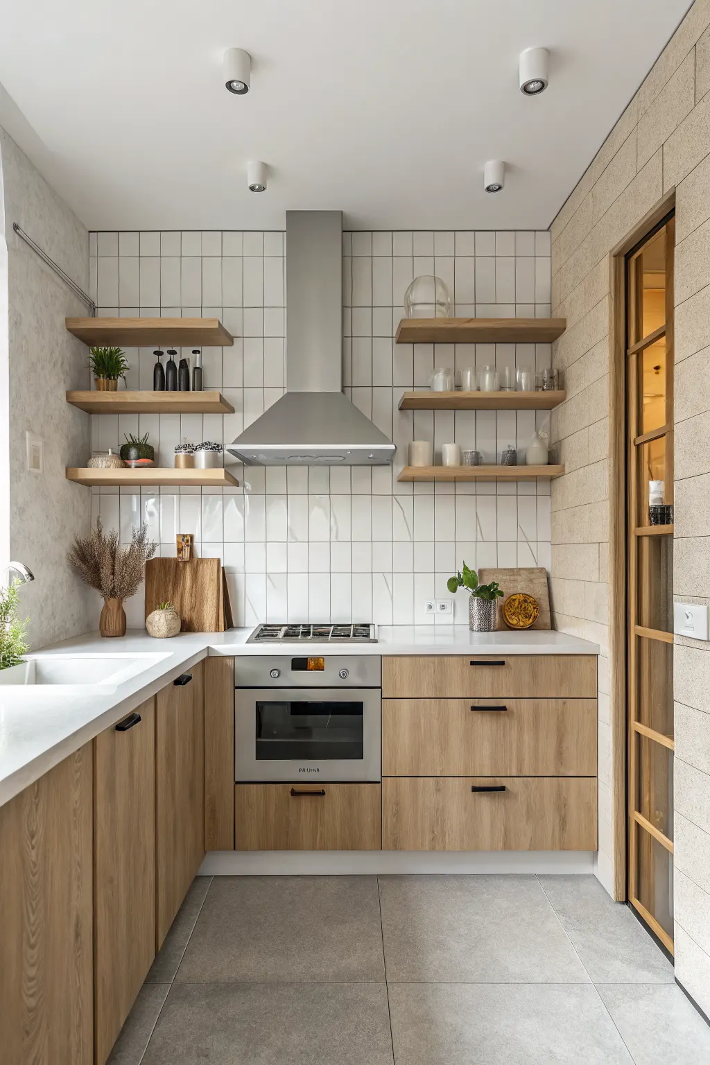
Instead of stopping tile at standard backsplash height, full-height tiling extends the surface up to shelves, a hood surround, or even the ceiling. This creates a more complete and cohesive backdrop.
It can be especially effective in compact kitchens because uninterrupted material makes the space feel more intentional and less chopped up. It also works beautifully on open shelving walls where painted drywall might otherwise break the look.
This approach does require more planning. Edge details, transition points, and overall budget matter more when tile covers a larger area. But visually, it can make the kitchen feel finished in a high-impact way.
24. Mixed Tile Finishes for a Layered Custom Look
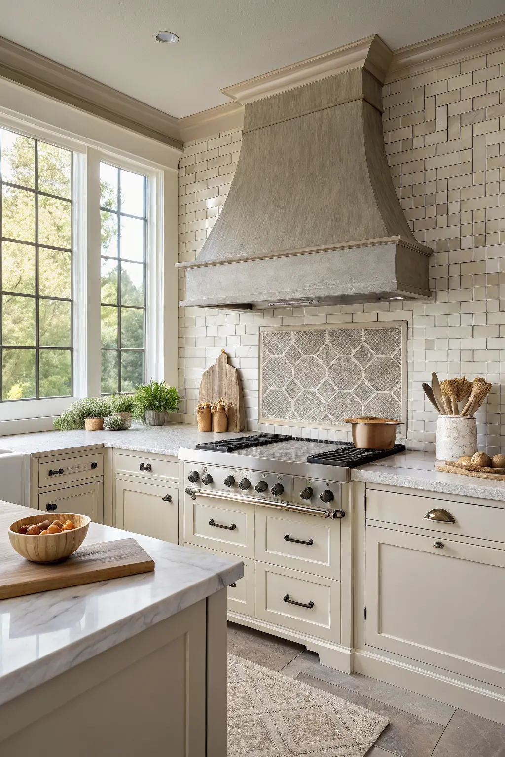
Mixing tile finishes is a smart way to add depth without relying on too many colors. You might combine matte and gloss versions of the same shade, smooth and textured surfaces in one palette, or plain field tile with a more decorative focal section.
This approach works well when you want the backsplash to feel designed and custom, but not chaotic. For example, a calm main wall tile can be paired with a slightly more reflective or textured insert behind the stove.
Restraint is important. Keeping the colors closely related usually helps the combination feel intentional rather than crowded or overly trend-driven.
25. Choosing the Right Kitchen Wall Tile for Your Layout, Light, and Lifestyle
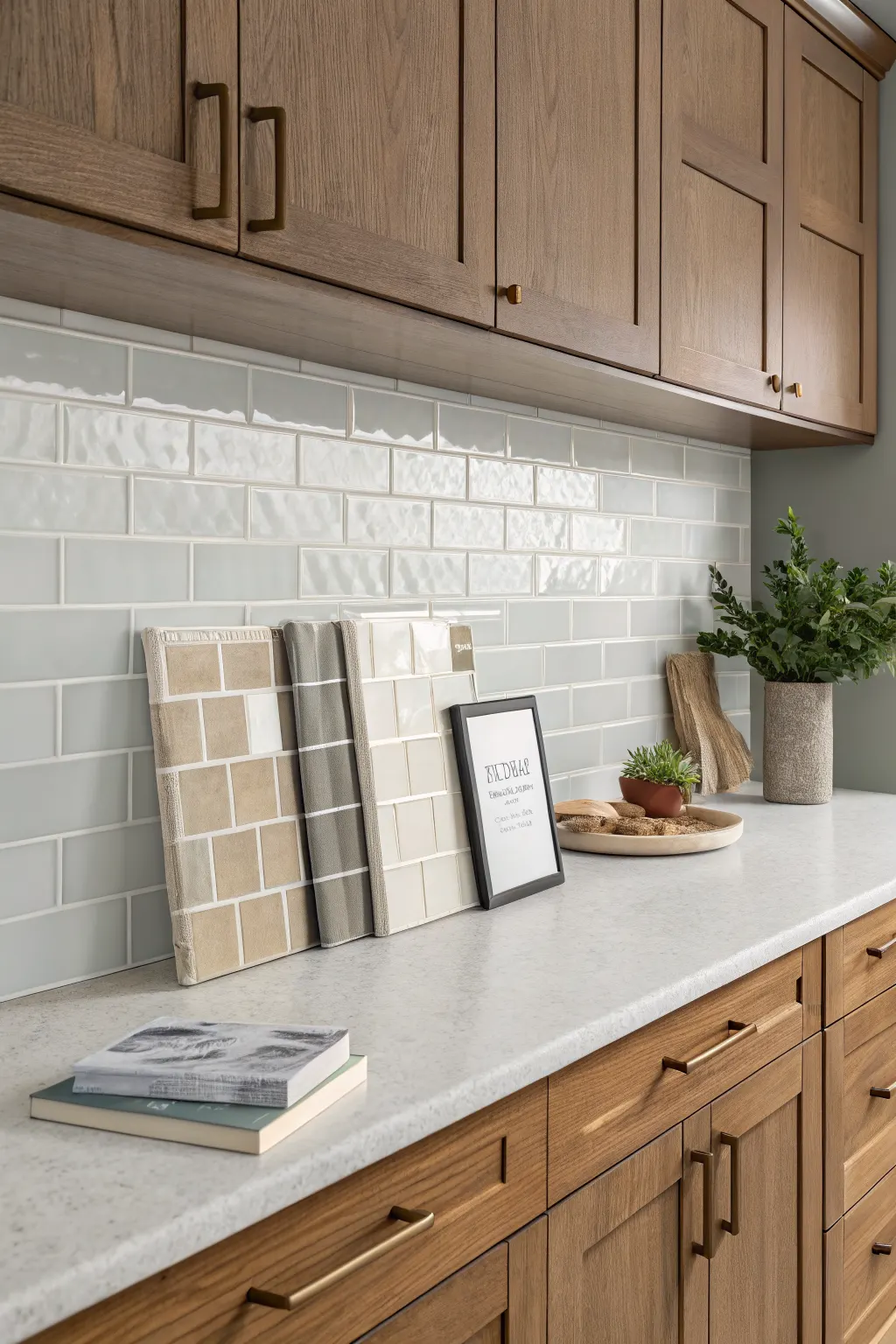
The best kitchen wall tiles are not just the ones that look good in photos. They are the ones that make sense for your kitchen’s size, cabinet style, natural light, and daily use.
If your kitchen is small or dark, lighter glossy finishes and simpler layouts often help. If you have strong countertops or cabinet colors, a quieter tile may create better balance. If you cook often, think carefully about grout visibility, surface texture, and how easily the wall will wipe clean.
It also helps to compare tile samples next to your counters, paint, and hardware before deciding. If you are still shaping the full look of the room, exploring kitchen cabinet color ideas or a few minimalist kitchen ideas can make your tile choice much easier to narrow down.
Conclusion
The right kitchen wall tile can make your space feel brighter, warmer, bolder, calmer, or more refined, depending on the direction you choose. Whether you prefer timeless subway tile, rich color, gentle texture, or a more dramatic statement, the best result comes from balancing style with everyday practicality.
As you narrow down your options, focus on how the tile works with your kitchen’s light, layout, cabinets, counters, and cleaning habits. That combination is what turns a beautiful backsplash into a choice that truly fits your home.
FAQ
What are the best kitchen wall tiles for easy cleaning?
Smooth ceramic, porcelain, and glass tiles are often the easiest to wipe down. Larger tiles and simpler layouts can also help because they usually mean fewer grout lines to maintain.
Which kitchen wall tile styles work best in small kitchens?
Glossy white tiles, light neutrals, vertical stacked layouts, and large-format tiles can all help a small kitchen feel brighter or less busy. Full-height tile can also create a more continuous look that visually opens the space.
Are matte or glossy kitchen wall tiles better?
Neither is automatically better. Glossy tiles reflect more light and can help brighten the room, while matte tiles offer a softer, calmer appearance with less glare. The better choice depends on your lighting, style, and maintenance preferences.
What grout color is best for kitchen wall tiles?
It depends on the effect you want. Matching grout creates a more seamless look, while contrast grout highlights the tile shape and layout. Mid-tone grout can be a practical compromise in kitchens where pure white grout may look high-maintenance.
How high should kitchen wall tiles go?
Standard backsplash height is common, but taking tile to the underside of cabinets, up to open shelves, around the hood, or all the way to the ceiling can create a more finished look. The right height depends on your layout, budget, and design goals.
